Color and texture
By JC | July 14, 2010
In the past few weeks, I’ve sent an early draft of Charts Made Simple to a few knitters, and asked for feedback: Does the book cover what it should? And does it do so in a friendly, encouraging way? Some of the responses have been fascinating. (And some scary, like the one noting the utter total mismatch between a photo and its caption—eek! Just the sort of thing that can slip through multiple rounds of editing, only to burst out of hiding once the book is printed.)
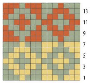
One knitter asked why the book didn’t draw a distinction between color charts and texture charts, why it didn’t explain how they have to be read differently. I had to say I didn’t see a sharp distinction, but a spectrum. At one end, you have charts for stranded or intarsia knitting, with colors in the chart squares.
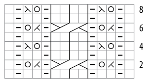
At the other end, you have charts for lace, cables, knit/purl patterns, and other forms of texture, with symbols in the chart squares.
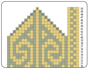
And in the middle? All sorts of charts! Consider a mitten chart showing stranded colorwork and shaping: a few of the charts squares are filled with both color and a symbol.
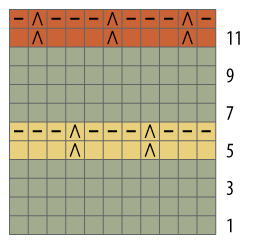
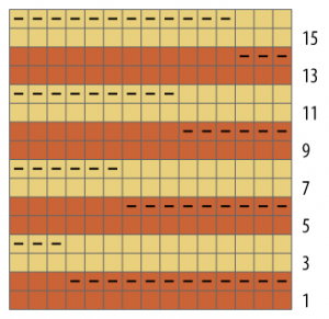
Or slip-stitch patterns: many chart squares specify both color and some sort of symbol.
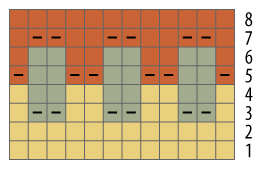
Or charts for shadow knitting: it’s the texture added by the garter ridges that turns simple stripes into subtle, viewed-at-an-angle color patterns.
Or Bohus-style charts: strategically-placed purls elevate stranded colorwork beyond stockinette into a gorgeous new realm.
As I see it, you read all these charts remains the same way. You keep in mind that the chart shows you a picture of the right side of the fabric. You read the chart in the same direction you knit: from the bottom up, back and forth if knitting flat or always from right to left if knitting in the round. And you let the contents of each chart square tell you how to create the next stitch. According to the chart’s key, you might need to knit with a specified color, k2tog with another color, or just plain k2tog. That’s chart reading, in a nutshell. And it doesn’t require drawing a distinction between color charts and texture charts.
Or am I missing something? Is it possible to draw a useful distinction between color charts and texture charts? Is it possible to say, “Do this when following color charts, but do that when following texture charts”?


8 Comments