That depends
By JC | July 15, 2010
Another bit of early feedback on Charts Made Simple questioned how mosaic charts are drawn: If the mosaic is worked on a base of garter stitch, should the chart squares have a bar or some other sort of “purl” designation, to indicate the garter ridges? In other words, does stockinette mosaic use different symbols than garter mosaic?
That depends. Who’s drawing the charts? And do they care if you use stockinette or garter?
As always, hunting through existing books and magazines reveals that different authors and publishers have selected from a fascinating array of charting options. The original way of charting mosaic patterns, as Barbara Walker set out in Charted Knitting Designs in 1972, does not distinguish between stockinette- and garter-based mosaic. Rather, the knitter is allowed—encouraged, even—to choose for herself. Ms. Walker even suggests mixing the two, using stockinette for one color and garter for the other, or using stockinette for one repeat and garter for the next.
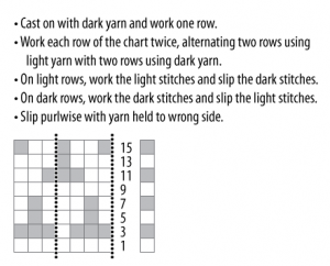
Note that each chart row represents two rows of knitting. Stated another way, each chart square represents one element of the mosaic design, even though that element happens to be two rows tall. Such charts are clean and compact, and resemble the end result well. You see them sometimes in published patterns—for example, in the pattern for Lynne Vogel’s Tree of Life Mosaic Jacket, in Knitting in America. You have to read the pattern (or be familiar with mosaic charts) to know how to follow the charts. And you have to read the pattern (or glance at the photos of the jacket) to know that you’re supposed to work the mosaic in garter stitch.
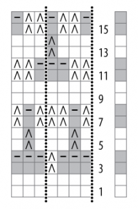
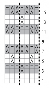
Often, though, charts for mosaic knitting are drawn just like other charts, with one chart row for every row of knitting and with symbols indicating when to slip, knit, or purl. This takes up more space, but doesn’t require any extra explanation, and does let the designer specify stockinette vs. garter. Such charts can resemble the fabric reasonably well, if the slip stitches are shown in the slipped color.
Or they can be a mess of meaningless stripes, if the slipped stitches are shown in the current working color.
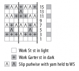
Me, I’m in favor of charts that resemble the end result. So I’m intrigued by charts that take a “hybrid” approach, with one chart row for every two rows of knitting, and with symbols indicating when to slip, and when to work stockinette vs. garter. You can see a few of these charts in Beautiful Knitting Patterns by Gisela Klöpper. I’m not fond of some of the symbols used in the book—in particular, for decreases and for cable crosses—but the mosaic charts strike me as complete, reasonably clear, and yet compact.
Once again, the only hard and fast rule is that you can’t make any assumptions when reading a chart. You have to read the key—and any special instructions—that come with the chart. Of course, that’s assuming you want to create the project exactly as the designer intended. If you want to interpret a chart “creatively” and do your own thing, go for it! I’m sure Ms. Walker would approve.
Comments are closed.


