XRX has just posted the brochure for Stitches Midwest—and it looks like it’ll be a fabulous event! The schedule is packed with lots of new classes. And I’m looking forward to the Opening Day Spotlight: Gwen Bortner, Laura Bryant, and Anna Walden will discuss “Building on the Bias” in an Entrelac Design Challenge.
The hiccups? Well, first off, I can’t take any of the new classes, as I’m teaching practically the whole weekend. Bummer!
Second, the brochure lists my new class as “Seamless Set-in Sleeves,” when I’d named it “Slick Set-in Sleeves.” Doesn’t “Slick” make the class sound like more fun? Oh, well. Maybe it’ll get fixed. Maybe not.
Third, the description of “Chart Reading” is off-kilter. The brochure ought to read:
The symbols of a chart take the place of written instructions, telling you what stitches to work. But a good chart does so much more, showing you what the knitted fabric should look like. In this class, you’ll learn to read charts, making sense of their symbols and using them to keep your knitting on track and to minimize mistakes.
Still, despite the hiccups, I’m excited to return to Schaumburg in August!
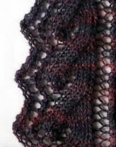
Lately I’ve been playing around with lace edgings. Here’s a favorite:
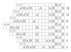
Normally, you’d see it charted like so:
The right edge of the chart is straight and the left edge zig-zags, like the edging itself. Yet this chart distorts the “leaf” motif within the edging. And the zig-zag edge is a little exaggerated.
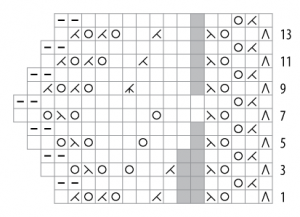
Here’s another charting option:
Tossing in a few “no stitch” symbols lets the other symbols line up vertically just like the stitches will when the edging is knit. It makes the leaf tip more apparent by placing its yarn overs in a V shape. And it makes the zig-zag more realistic. In short, it lets the chart more closely resemble the edging.
Which chart is “better”? It depends on your tolerance for “no stitch” symbols, I guess. My tolerance is quite high. Besides, I have a strong fondness for charts that look like the stitch patterns they represent. So—no surprise here—the second chart turns my crank.
But if the chart were destined for publication? Ah, that’s the real question. Which would cause more confusion for the novice chart reader: a chart that doesn’t much look like its stitch pattern, or a chart that contains “no stitch” symbols?
What do you think?
Over the past few years, I’ve drawn a lot of charts: for tech editing clients, for my own patterns, and just for my own use. My tool of choice is Illustrator—nice, sharp, vector graphics and complete control over every aspect of the charts, from colors and fonts and line widths to the actual chart symbols. Yes, I’ve had to draw the symbols myself—they didn’t come as part of some canned package—but that was fine with my inner control freak.
At the same time, my inner consistency freak has wondered why my chosen set of symbols is inconsistent. If ![]() makes sense (to me) for k2tog and
makes sense (to me) for k2tog and ![]() for p2tog, why do I use
for p2tog, why do I use ![]() for purl rather than
for purl rather than ![]() ? If
? If ![]() is k3tog and
is k3tog and ![]() is sl1-k2tog-psso, why is sl2-k1-p2sso a “tailless”
is sl1-k2tog-psso, why is sl2-k1-p2sso a “tailless” ![]() instead of
instead of ![]() ? And so on.
? And so on.
And then, a few days ago, I had a little epiphany. The symbols I draw in Illustrator match the ones I draw in pencil on graph paper. Occasionally decorating a ![]() k2tog with a dot to turn it into
k2tog with a dot to turn it into ![]() p2tog is fine, but when you gotta draw field of purl stitches? A bunch of
p2tog is fine, but when you gotta draw field of purl stitches? A bunch of ![]() dashes is way faster (for me) than
dashes is way faster (for me) than ![]() dots. And a neat
dots. And a neat ![]() when you’re drawing in a hurry, anxious to get an idea down on paper? Not gonna happen.
when you’re drawing in a hurry, anxious to get an idea down on paper? Not gonna happen.
So there you have it. When it comes to my chart symbols, laziness and impatience trump consistency. Who knew?
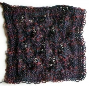
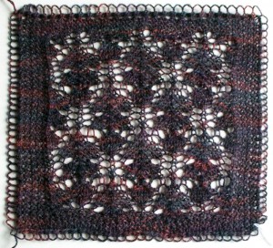
Here’s a swatch of Blue Moon Fiber Arts Geisha, in Thistle Leaf pattern from A Second Treasury of Knitting Patterns by Barbara Walker, before and after blocking:
Isn’t the transformation amazing? From lumpy, misshapen, and obscured to crisp and bright.
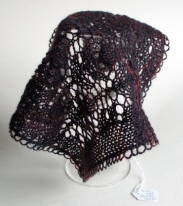
And now, instead of curling up into a ball, the fabric wants to drape:
Ya gotta love blocking. Ya gotta love little paper hang tags too. The one shown above gives the source of the stitch pattern on one side, and the name of the yarn and the needle size on the other side. The swatch wouldn’t be of much use to me without its hang tag. Months from now, I could guess at the stitch pattern and yarn. But the needle size? Forget about it.
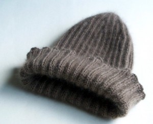
My most recent FO isn’t much to look at: it’s just a simple hat, in k2, p2 rib, in a rather drab shade of brown.
Oh, but to touch it! Soft, lightweight, and incredibly warm, the hat’s made of qiviut.
What prompted me to dive into my dwindling stash of fingering-weight qiviut? A friend going through chemo.
Let’s hope she likes her new hat.
Like many knitters, I’m on a yarn diet. It’s not that I have a huge stash, but it manages to grow faster than I can knit it. And I don’t really have room for a huge stash.
Usually, I’m good about sticking to the yarn diet. I’m strong. I can walk past pretty yarn without flinching (much).
Yet reading Clara Parkes’ The Knitter’s Book of Wool got me hankering for breed-specific yarns. And what do you know, our local farmer’s market often has a stall or two selling local yarn.
The stall with the yarn in Kool-Aid colors? No, thanks. Ah, but the new stall, the one I swear I hadn’t seen before… look! Skeins in a slew of lovely natural colors. And labeled by breed!
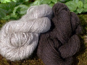
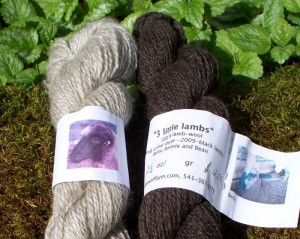
With Clara’s voice in my head urging me on, I walked away with two skeins:
The skein on the left is Coopworth; on the right, lambswool from Coopworth/Romney lambs.
The best part? The labels name the animals that produced the fiber, and even include photos:
The skein on the left is all Anna. On the right, a blend of Berta, Bonnie, and Beau.
I had a nice chat with the vendor, who told me all about the lambs’ parentage, and how the yarn was spun at a local mill willing to handle small lots. I had no idea the mill existed—but I think I can be excused, since the mill has only been in operation for just over a year. Besides, I’m not a spinner.
What will I do with the yarn? I’m not sure yet. I’m tempted to make fingerless mittens in stranded colorwork, but I’m kind of hard on my mittens and I’m not sure the loosely-spun two plies would stand up to the abuse. Maybe a hat, then, lined with something softer. Hmm… what do I have in my stash?
Now what?
By JC | March 17, 2010
Last fall, I was surprised and pleased when Mona of Dye Dreams asked if I’d like to design a sock for their sock club. Choice of yarn base? Choice of nearly solid colorway? Sure, sign me up!
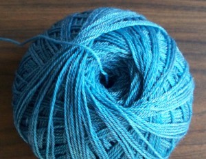
Fast forward to Stitches West, where I had a delightful meeting with Mona and Stephanie, and walked away with this:
Lovely stuff, just lovely. And oh so shimmery.
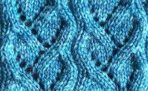
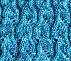
I’ve swatched a number of stitch patterns since then, looking for just the right sinuous feel that invokes water: waves lapping on a beach, rivulets in the sand, that sort of thing. Here are two top contenders:
I love the flowing, overlapping look that both of these stitch patterns have. The question is: now that I’ve found stitch patterns that I like, what do I do with them? How do I place one or both within a sock design?
I’m tempted to use both. Unfortunately, their row repeats aren’t compatible (rivulets is 12 rows tall; little waves is 8), and tweaking the patterns to make them compatible would muck up the patterns too much, destroying what I like about them. (Ask me how I know.) So if they were placed side by side, they wouldn’t bend and sway in unison. Bummer.
Another option: use little waves in a foldover cuff, with rivulets flowing below. Hmm… maybe. I do like foldover cuffs for summer socks.
One more option: use little waves in a toe-up sock with a round toe, and end with the waves flowing into ribbing. Hmm… could be. Guess I have more swatching ahead of me.
What do you think?
Well, after a series of fits and starts, here I am in blogland.
Why am I blogging? Partly to practice writing. Like anything else, I hear it gets easier with practice. And with the blog I hope I’ll feel a little freer than when writing class handouts and the like, where clarity and brevity are vital.
But I’m blogging mostly to share shiny new things: ideas, stitch patterns, techniques, project updates, stash enhancements, that sort of thing. You know, the kind of stuff knitters get all excited about, but when you tell your sweetie over the dinner table, his eyes just glaze over. Well, okay, maybe that eyes-glazed-over bit doesn’t happen to you. But you know what I mean.
Let’s see where this leads, shall we?


