Which do you prefer?
By JC | April 3, 2010
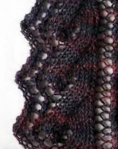
Lately I’ve been playing around with lace edgings. Here’s a favorite:
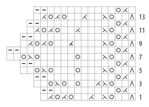
Normally, you’d see it charted like so:
The right edge of the chart is straight and the left edge zig-zags, like the edging itself. Yet this chart distorts the “leaf” motif within the edging. And the zig-zag edge is a little exaggerated.
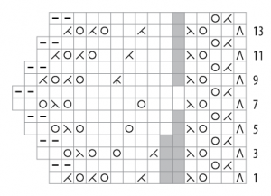
Here’s another charting option:
Tossing in a few “no stitch” symbols lets the other symbols line up vertically just like the stitches will when the edging is knit. It makes the leaf tip more apparent by placing its yarn overs in a V shape. And it makes the zig-zag more realistic. In short, it lets the chart more closely resemble the edging.
Which chart is “better”? It depends on your tolerance for “no stitch” symbols, I guess. My tolerance is quite high. Besides, I have a strong fondness for charts that look like the stitch patterns they represent. So—no surprise here—the second chart turns my crank.
But if the chart were destined for publication? Ah, that’s the real question. Which would cause more confusion for the novice chart reader: a chart that doesn’t much look like its stitch pattern, or a chart that contains “no stitch” symbols?
What do you think?


11 Comments