

A matter of legibility
By JC | August 18, 2014
Like I said, I think most cabled stitch patterns are best charted using traditional, grid-based charts. Then you can use simple, streamlined symbols like these:
But with stitch maps? You can’t rely on a surrounding grid for context. In some way, each symbol has to indicate how many stitches are being crossed, and how those stitches are being worked. This means symbols like those above just aren’t appropriate: without a surrounding grid, they don’t clearly show how many stitches are involved in the cross.
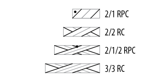
So for a long time, I had figured that Stitch-Maps.com would make use of symbols like these:
I think of them as “Japanese” because they’re used in Japanese publications, but they appear in some US publications too. Each diagonal line represents a stitch, crossing over or under. Straightforward, right? An easy choice.
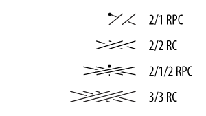
Not so fast. These symbols get pretty darn messy when they’re wide:

Or when the stitches are knit through back loop to twist:

So, in the name of legibility – the degree to which symbols are “understandable or recognizable based on appearance” – now I’m thinking Stitch-Maps.com will display cable cross symbols like these:
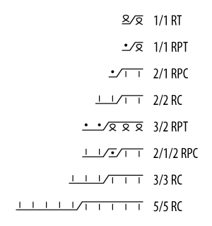
I call these “lightning bolt” or “zig-zag” symbols: zig-zag lines indicate the number of stitches in each strand and how the strands cross, and individual mini-symbols tell you how to work each stitch. Super clear; super legible.
The downside to these symbols? I don’t find them quite as intuitive as other cable cross symbols. But I figure their legibility makes them worth it.
Your thoughts?
1 Comment