Unnecessary funkiness
By JC | February 4, 2011
Some of you may have noticed that, of late, the actual knitting content on this blog has been… well… sparse. Practically absent.
Partly it’s because my attention has been elsewhere, on a large cough book cough project. Partly it’s because my knitting mojo has been missing: I just haven’t felt like knitting, so I haven’t had much to show. (It happens, sometimes. Don’t worry; my mojo will find its way back eventually. It always does.)
Still, this is a knitting blog, and knitting content of some sort is in order. So lemme share a little pet peeve with you. It’s something I’ve kept under my hat for a long time, in the name of being polite and tolerant and all that piffle.
Chart symbols that aren’t as wide as the number of stitches they represent—like ![]() for a centered double increase, or
for a centered double increase, or ![]() for knit into front and back of next stitch—irk the snot out of me.
for knit into front and back of next stitch—irk the snot out of me.
Whew! It feels good to say that out in the open. 🙂
Here’s why: Most chart symbols are as wide as the number of stitches that end up on your right needle when you have completed whatever that symbol is telling you to do. ![]() ,
, ![]() , and
, and ![]() are all one square wide because working any of them—p1, k2tog, or yo—results in one stitch on your right needle, even though you need one stitch to p1, two to k2tog, and none to yo. Likewise,
are all one square wide because working any of them—p1, k2tog, or yo—results in one stitch on your right needle, even though you need one stitch to p1, two to k2tog, and none to yo. Likewise, ![]() is four squares wide because working a two-over-two cable cross results in four stitches. What matters is the number of stitches you end up with, not the number you start with. Nearly all chart symbols work this way.
is four squares wide because working a two-over-two cable cross results in four stitches. What matters is the number of stitches you end up with, not the number you start with. Nearly all chart symbols work this way.
(Side note: I know of only one book—that shall remain nameless; I don’t want to add to its notoriety—where all the symbols work the opposite way, each as wide as the number of stitches you need to work the symbol. K2tog are two squares wide; yo are dots between chart squares. Take my word for it—those charts are icky!)
Mixing standard, sensible, as-wide-as-the-stitches-they-produce symbols with symbols like ![]() and
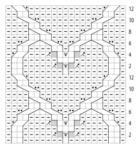
and ![]() leads to unnecessary funkiness in charts. Take a gander at this example:
leads to unnecessary funkiness in charts. Take a gander at this example:
You have heart-shaped cables, stacked in a column. Each heart begins with some increases geared to make the heart’s pointy end appear suddenly in sharp relief against the reverse stockinette background. Matching decreases keep the stitch count constant. Yet because ![]() isn’t as wide as it should be, placeholder “no stitch” symbols have to be thrown in to fill in the gaps.
isn’t as wide as it should be, placeholder “no stitch” symbols have to be thrown in to fill in the gaps.
Don’t get me wrong. I’m a big fan of “no stitch” symbols when they’re used properly: to indicate changes in stitch count, or to allow elements of a stitch pattern to line up vertically in the chart as they will in the finished fabric.
But the “no stitch” symbols in the example above are completely unnecessary. And they’re confusing: glancing at the chart, you’d think the stitch count changes from row to row—but it doesn’t.
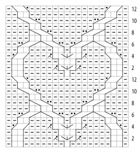
What’s the alternative? Consistently using symbols that are as wide as their resulting stitch count, such as ![]() for centered double increases and
for centered double increases and ![]() for knit into front and back. Consider:
for knit into front and back. Consider:
Voilà! With ![]() for centered double increases, the placeholder “no stitch” symbols can go away.
for centered double increases, the placeholder “no stitch” symbols can go away.
So? Have I convinced you to abandon ![]() and
and ![]() in favor of
in favor of ![]() and
and ![]() ? If not, I can rant further.
? If not, I can rant further.


6 Comments